Celebrating 75 Years of Faith –
Novena Church 75th Anniversary Logo Design
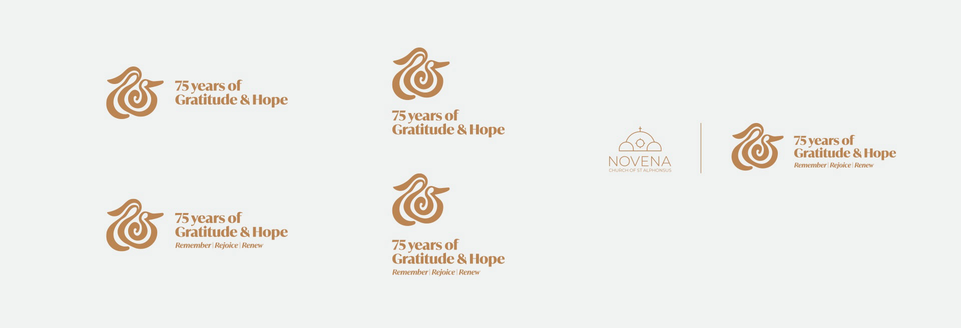
The 75th Anniversary Logo for Novena Church was an opportunity to celebrate the Church’s journey of faith, gratitude, and hope over seven and a half decades. The goal was to design a logo that reflects the Church’s identity, encapsulating its rich heritage, its role as a uniting force in the community, and its deep devotion to Mother Mary and Jesus, while presenting it in a fresh, modern way.
Process & Strategy
To begin, I immersed myself in understanding the theme of Gratitude & Hope, with its three pillars—Remember, Rejoice, Renew. These concepts informed a visual narrative that highlighted the Church’s enduring faith, the strength of its community, and its mission to spread hope and love. Researching the Church’s history and studying its iconic architecture, especially its arches, provided a foundation for the design. Catholic symbolism, including representations of Mother Mary, Jesus, and the rose, further enriched the creative process.
Through careful ideation and exploration, I developed mood boards and sketched potential designs that could harmonize abstract and representational elements. The goal was to create a logo that respected the Church’s deep spiritual roots while feeling contemporary and relevant for modern audiences.


Creative Solution
The final logo was thoughtfully crafted to encapsulate Novena Church’s journey of faith and community. The strokes of varying thickness represent the ups and downs of this journey, filled with challenges, growth, and blessings. At the center, a spiral symbolizes the unity of the Church’s community, emphasizing the idea that individuals from different walks of life are united in faith.
The figures of Mother Mary and Baby Jesus are subtly integrated into the design, representing their constant guidance and love throughout the Church’s history. Additionally, the logo’s structure is reminiscent of a rose, symbolizing devotion and prayer through Mary’s intercession.
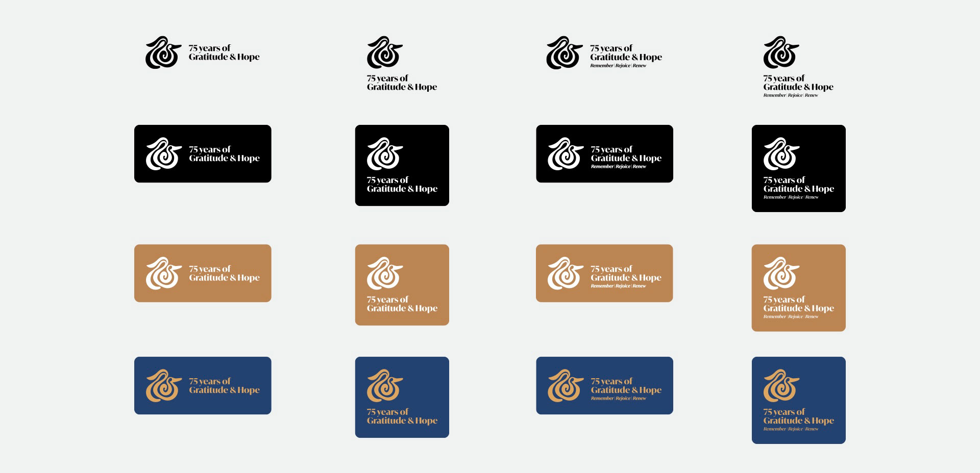
The gradient color palette of deep blue and gold provides a modern twist. The blue reflects devotion to Mother Mary as a comforting and guiding presence, while the gold represents eternal life through Jesus, symbolizing divine grace and hope. Together, they balance tradition with renewal. The typography, featuring a sleek sans-serif font, reinforces the timeless and approachable nature of the design.
The visual language takes cues from Novena Church’s iconic arches, incorporating hopeful lines that double as frames for imagery, bridging the Church’s legacy with a modern design approach.
Reflection
This project, completed in just one day, tested my ability to make creative decisions under a tight timeline. It required a structured thought process, prioritization of key elements, and a clear focus on storytelling. Working within such constraints pushed me to stay objective and keep my eyes fresh, avoiding bias toward early design iterations.
Although this design was not selected as the winning logo, the process of creating it was a meaningful journey in itself. It was an opportunity to deeply engage with the rich history, values, and mission of Novena Church. The design reflects a thoughtful interpretation of the Church’s journey of faith and community, guided by Mother Mary and Jesus.


