Beezing is an innovative language school blending Montessori-inspired learning with fun, interactive activities. Their unique “learn, re-learn, and teach” methodology ensures knowledge truly sticks. The goal was to design a brand identity that reflects their vibrant, collaborative approach to learning, with a playful yet purposeful vibe.
Process and Strategy
Understanding the Brand: I explored the school’s core values of collaboration and creativity, inspired by their name—symbolizing the “buzz” of learning and teamwork, much like a busy beehive.
Research and Ideation: Studied education and lifestyle branding trends to find the balance between playfulness and professionalism.
Concept Development: Crafted mood boards focusing on energy, collaboration, and inspiration, leading to a design language that feels lively yet meaningful.
Creative Solution
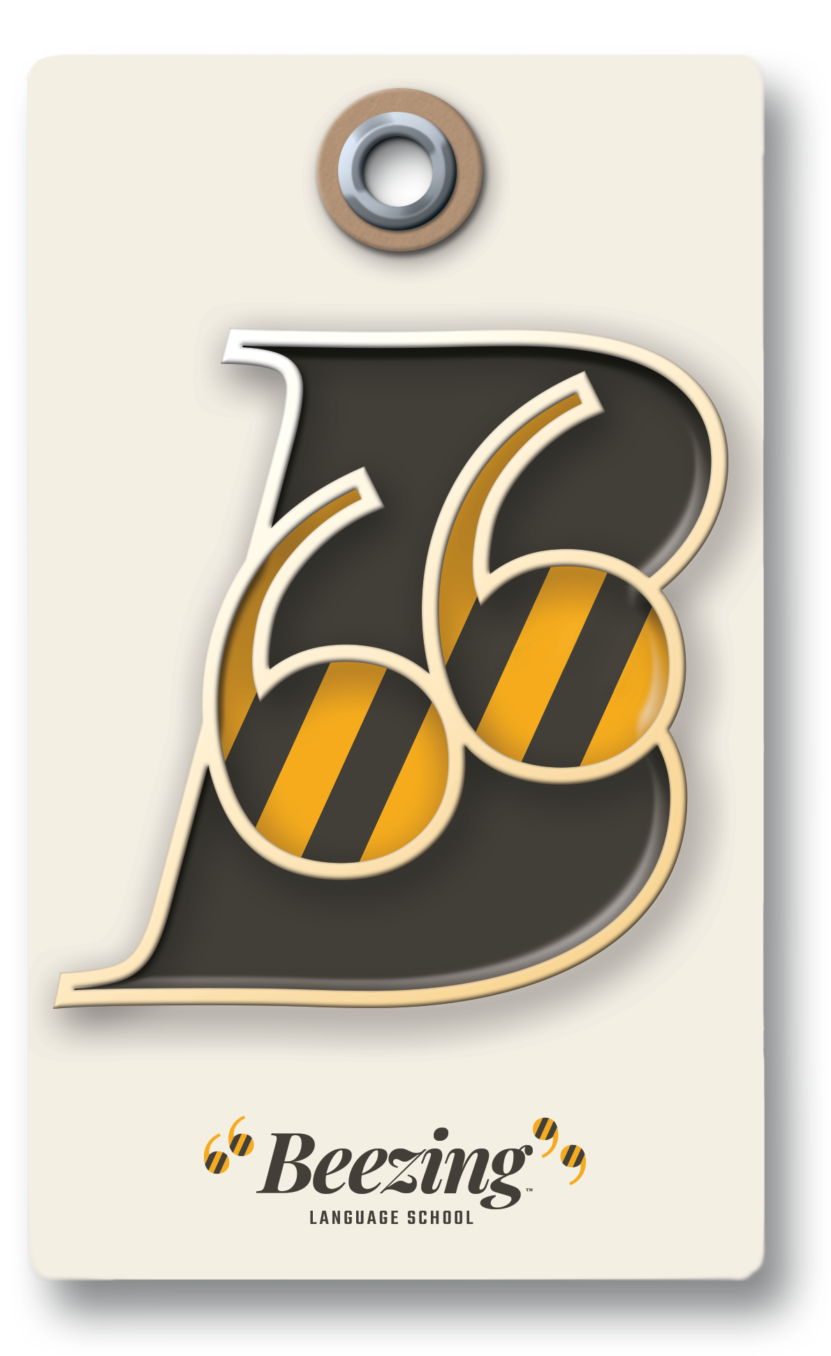
Logo Design: A dynamic logo combining a bee and a quote mark to symbolize communication, learning, and collaboration.
Colour Palette: Bright, energizing yellows paired with grounding neutrals to evoke positivity and focus.
Typography: A mix of modern sans-serif and handwritten-style fonts to blend structure with creativity.
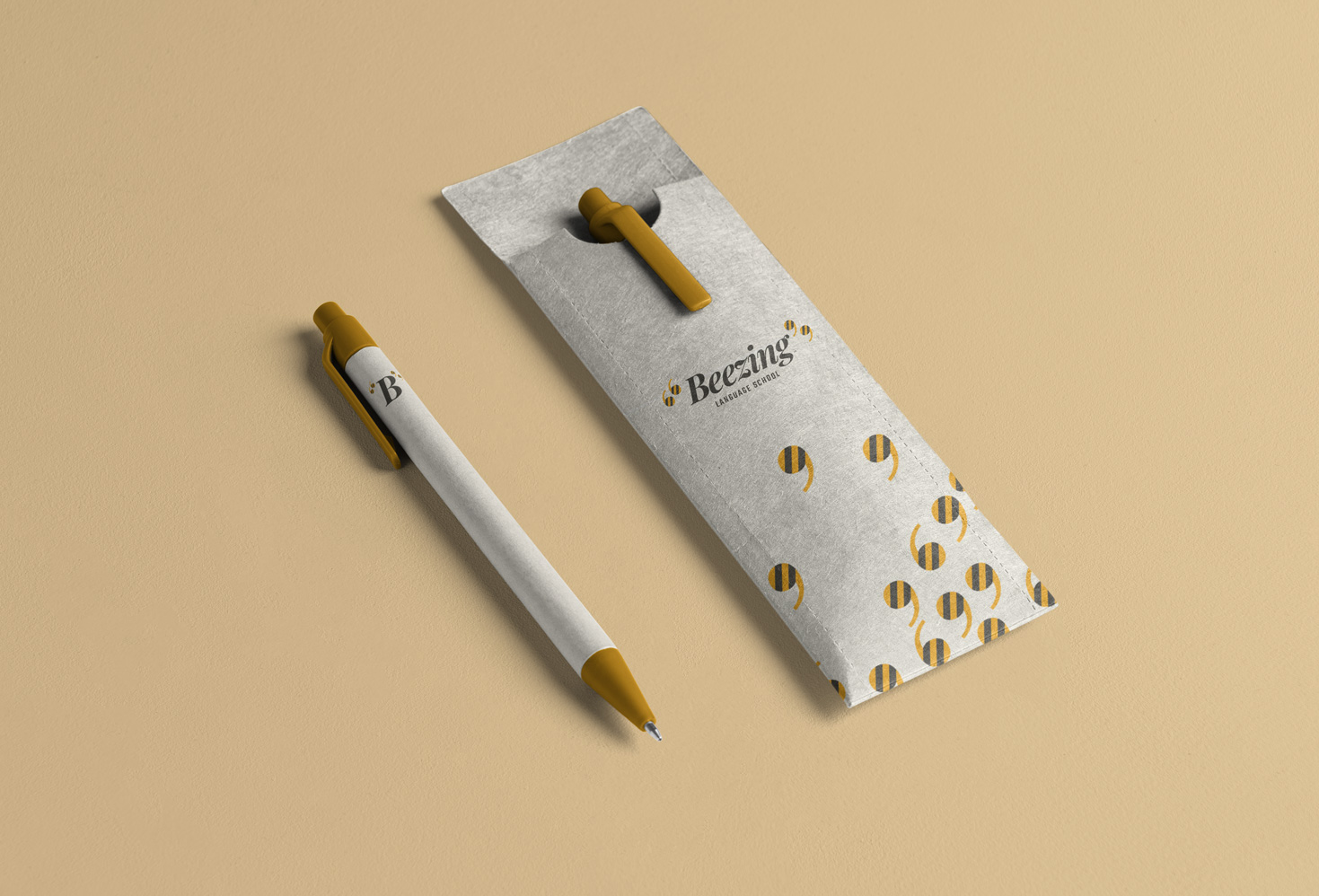
Visual Language: Playful patterns that reflect a buzzing hive of activity.


Results
Even as a conceptual project, the Beezing identity showcases how thoughtful design can encapsulate a brand’s mission. The final result is a brand full of life and purpose, visually communicating Beezing’s commitment to making learning engaging, memorable, and fun.
Through this project, I gained valuable insights into designing for educational brands and creating identities that resonate emotionally with their audience.
